Branding
NadirSpices—BrandIdentity
A full identity system for a Kerala spice exporter — mark, palette, packaging and a 40-page guideline book.
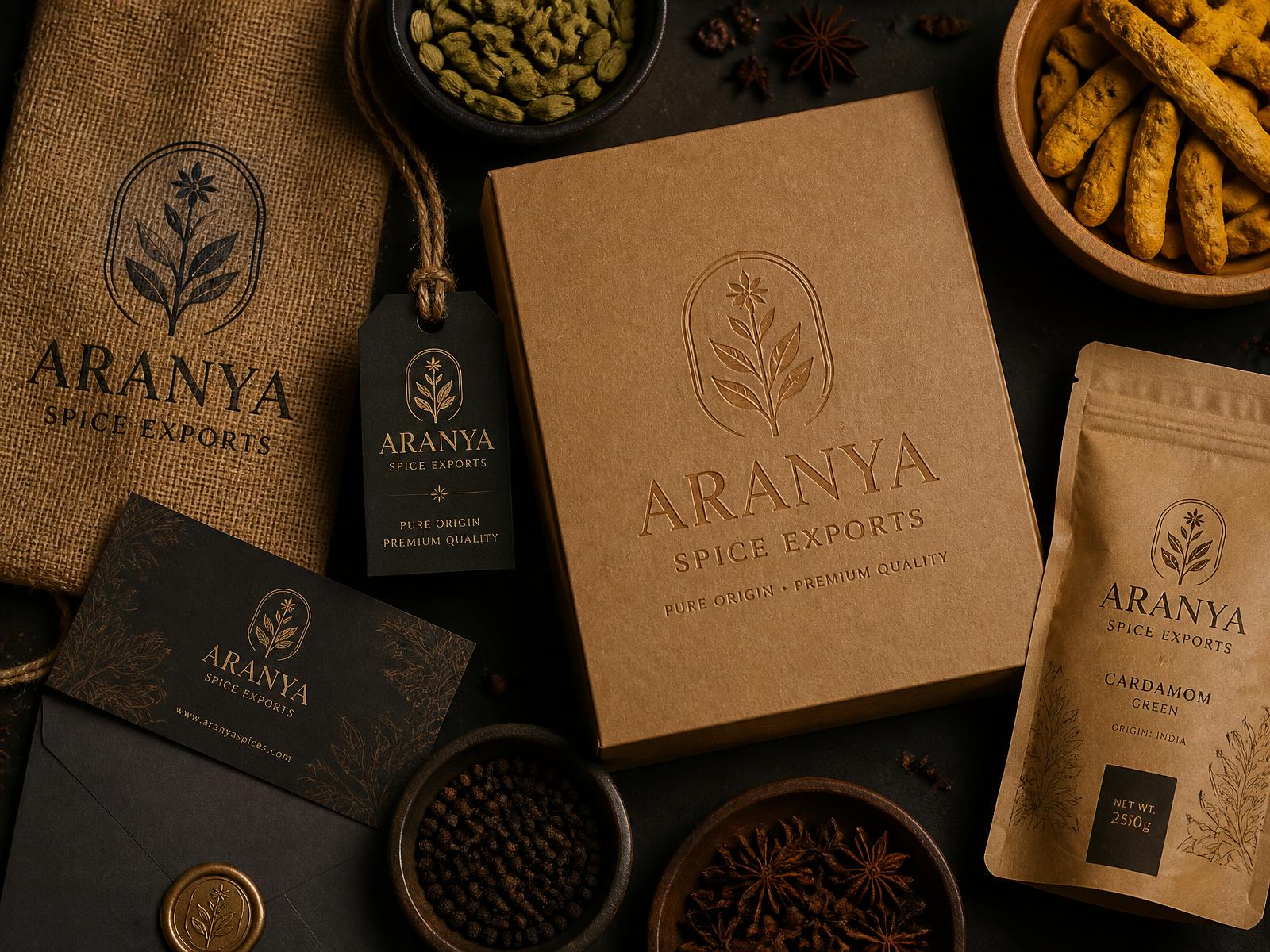
Overview
Nadir had 30 years of trade history and no coherent identity. The brief was to look export-grade without losing the origin story, so the system is built on a single stamped mark, a warm earth palette, and typography that survives being printed on jute.
01The problem
Three logos in active use, no colour discipline, and packaging that looked domestic next to the competition it was shelved beside.
02What I did
Ran a positioning workshop, built a single stamped mark drawn from the family seal, set a warm earth palette with strict contrast rules, and designed the primary and secondary packaging range.
03How it was made
Mark drawn in Illustrator and tested at 8mm before anything else. Guidelines laid out in InDesign across 40 pages covering mark usage, colour, type, photography and packaging dielines.
Sunbird Straws Website
NextMonsoon Fest — Campaign Posters